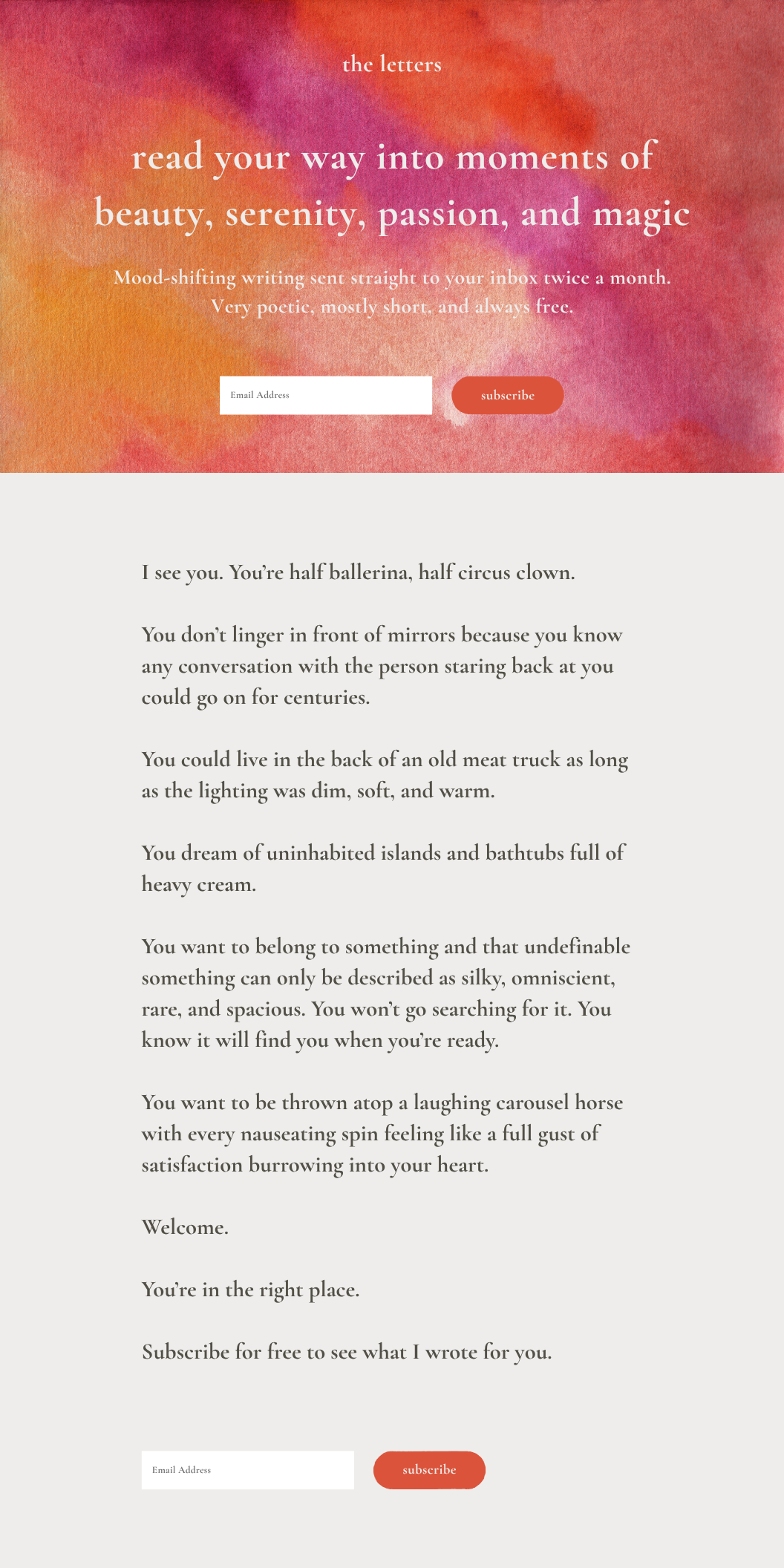
One-Page Website for The Letters
Client: The Letters is an email newsletter that sends creative writing to subscribers twice a month.
Audience: Young to middle-aged men and women actively trying to reduce their social media usage and shift to reading more. Smart phones have left them too burned out to pick up a novel. They are interested in shorter material but don’t want to sacrifice artistic depth.
Tone: Sincere, passionate, inviting, mysterious.
Challenge: The client was starting a free email series to share her creative writing. Knowing that reading rates and attention spans have dwindled, the challenge was to communicate the joys of a mentally-demanding task (reading) to a smart-phone-distracted audience then direct them to subscribe to receive emails.
Strategy: To immediately confront potential hesitancy to signing up, I used the headline to frame reading the client’s work as a pleasurable experience (moments of beauty, serenity, etc…) The subhead includes “mood-shifting” to produce further enticement, “straight to your inbox” to signal effortlessness, and “twice a month” to communicate lack of inbox burden due to infrequency. The body copy provides an idea of the type of content available to subscribers. It also paints a picture of a fantasy identity through which the client’s audience can live vicariously. Subscribing would be the next step to assume this fantasy identity and enjoy the benefits of being part of something fun, meaningful, and unique.